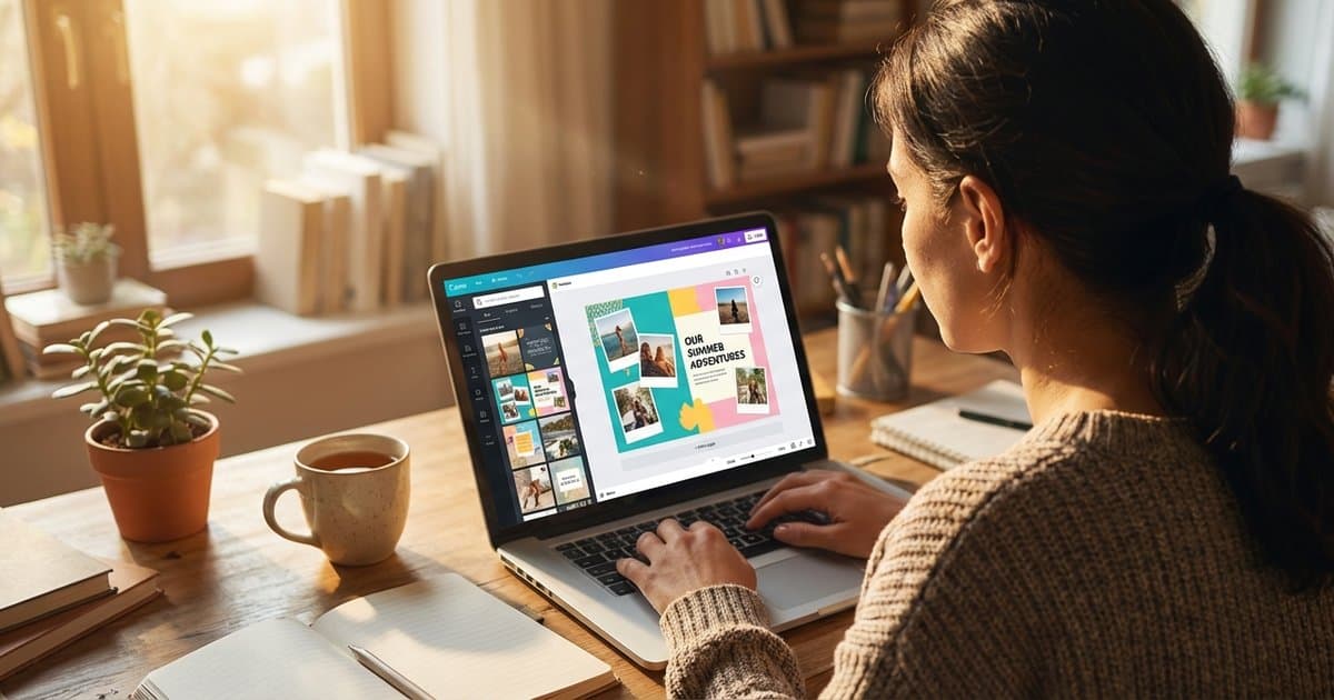
The MyScrapbook Studio Features Our Community Uses Every Single Week
Saturday evening is a good time to pay attention to what's actually working.
We talk to early community members constantly — through our waitlist, feedback surveys, and a steady stream of emails from people who've been using the beta. This week, we asked a simple question: which features do you find yourself reaching for every single week without fail?
The responses were more consistent than we expected. The same handful of features came up again and again. Here's what the community told us — including how they're actually using each one, not just what it does on paper.
1. The Eyedropper Color Picker
Nobody predicted this one. It wasn't in our original pitch deck. We added it because it seemed obvious — and it turns out it's the thing people mention the most.
The idea is simple: hover over any photo in your layout, click the eyedropper, and MSS samples that exact pixel colour and adds it to your palette. You can then apply that colour to text, backgrounds, borders, or embellishments anywhere on the page.
The result is that every element shares colour DNA with your photos. The accent on your title matches the blue in your son's shirt. The border around a photo pulls from the sunset behind it. Pages start to feel cohesive in a way that's hard to explain but obvious when you see it.
One community member put it plainly: "I used to spend twenty minutes hunting for a colour that worked with my photos. Now I spend thirty seconds and it's always right."
How to use it: Open any layout, click on a photo, then select the eyedropper icon in the colour picker. Sample from shadows, midtones, and highlights separately — darker tones work better for text, lighter ones for backgrounds.
2. Cloud Auto-Save
This sounds like a utility feature. In practice, it changes how people work.
When there's no risk of losing progress, people scrapbook differently. They try things they'd have been reluctant to try otherwise. They experiment more, and they leave a layout half-finished without anxiety.
Our community uses cloud sync to pick up layouts across devices — starting at a desk, finishing on the couch, or pulling up a project on a different computer to check how it looks on another screen. A few people mentioned starting work on a lunch break and finishing it that evening from home.
The sync is quiet. No "saving…" indicator flashing, no progress bar. Your work just exists wherever you are.
Practical note: If you're mid-session on something big, hit the manual Save button once before closing. Auto-save runs every 30 seconds, but a manual save gives you peace of mind before stepping away.
3. The Font Pairing Panel
Typography is one of those things where bad choices are visible and good choices are invisible. Most people pick a font they like and use it everywhere. The pages look fine, but they don't look deliberate.
MSS's Font Pairing panel suggests complementary fonts based on your current selection. Pick a display font for your title and it shows three or four body font options that work well alongside it. The pairings are built around real design principles — contrast, weight, x-height relationships — not just "fonts that look vaguely similar."
Community members who've started using it consistently report the same shift: their pages started getting comments they hadn't received before. "Something feels different about your layouts" is a phrase that came up in feedback more than once. The something is usually the typography. It stopped being an afterthought.
Quick rule: Don't use more than two fonts on a single page. The panel will give you a heading font and a body font — stick with those two. A third font almost always makes things worse.
4. The Layout Thumbnail Preview
Before this existed, switching layouts meant committing to one. You'd move everything around, see if it worked, then shuffle it back if it didn't.
The thumbnail preview lets you hover over different layout options in the template panel and see how your current photos would look in that structure — before you commit. Photos are roughly placed, spacing is shown, and you get a real sense of whether a layout fits your content in about three seconds.
For people who are indecisive (which, based on feedback, is most of us), this removes a lot of friction. The choice becomes visual and immediate instead of abstract.
Community members use this most often at the start of a session, cycling through several layouts to find one that suits the photos they're working with. Several mentioned picking layouts they'd have skipped entirely, because seeing the thumbnail showed them something they couldn't have imagined on their own.
How to get there: Click "Change Layout" from any active page, then hover over each option in the panel. Give it three seconds per layout rather than clicking immediately — your eye needs time to process what it's looking at.
5. The Full-Page Export at Print Resolution
This one surprises people when they find it.
Most digital scrapbooking tools are screen-first. They produce files that look good on a monitor but fall apart when printed — pixelated, muddy, nothing like what you made. MSS exports at 300 DPI by default, which is the standard for professional printing. A layout that looks good on screen will also hold up as a 12×12 print, a photo book page, or a framed piece on a wall.
The community members who discovered this often mention that it changed their sense of what MSS actually was. It's not just a screen tool — it's designed to produce physical objects. Several have ordered printed albums through third-party services using MSS exports, and the quality caught them off guard.
What to do with it: Export at full resolution and take the file to any local print shop, or upload to any print-on-demand service that accepts JPG or PDF. The 300 DPI output means the file is ready to use — nothing extra required.
What These Features Have in Common
These five features reduce friction at exactly the moment it usually kills creative momentum.
The eyedropper makes colour decisions instant. Auto-save removes the anxiety of losing work. Font pairing takes the guesswork out of typography. Layout preview removes commitment anxiety. Print export closes the gap between a digital page and a physical one.
When friction goes away, people actually finish things. And based on what the community sends us — finished layouts, printed albums, pages they're proud enough to share — that's what's happening.
If you haven't tried all five yet, pick one and run with it this weekend. Each is fast to pick up and pays off on the first page you use it on.
Keep Reading
Want early access to all of these features? Join the waitlist at myscrapbookstudio.com and be part of the community helping shape what we build next.